Remember that joke that did the rounds on LinkedIn a few years ago?
“Big Data is like teenage sex – everyone is talking about it but nobody is actually doing it”
Well, for many, the same could be said of personalization. While it is frequently crowned a “ecommerce hot topic”, with quantifiable benefits for both businesses and customers, it seems many still don’t know how or where to get started.
Which is why, we are going to show you how personalization can be used on almost every page of your website. As well as which recommendations are best used where and why…
Homepage:
Your digital storefront and one of the most important pages on your site. The aim here is to capture their attention. And quickly. The average internet user only spends 3 seconds on a homepage before deciding whether to delve deeper.
Just as with real-life interactions, the way you greet someone on your homepage should depend on whether you have (digitally) met before…
Best sellers for new visitors:
When a new shopper comes to your homepage, you won’t have enough data to personalize their shopping experience. But that isn’t to say that you shouldn’t interact with them with the hopes of enticing them further. In a bricks and mortar store, while you are still learning someone’s preferences you may start by showing someone your most popular pieces – why should online be any different? For that reason, we recommend the use of a Best Seller recommendation.
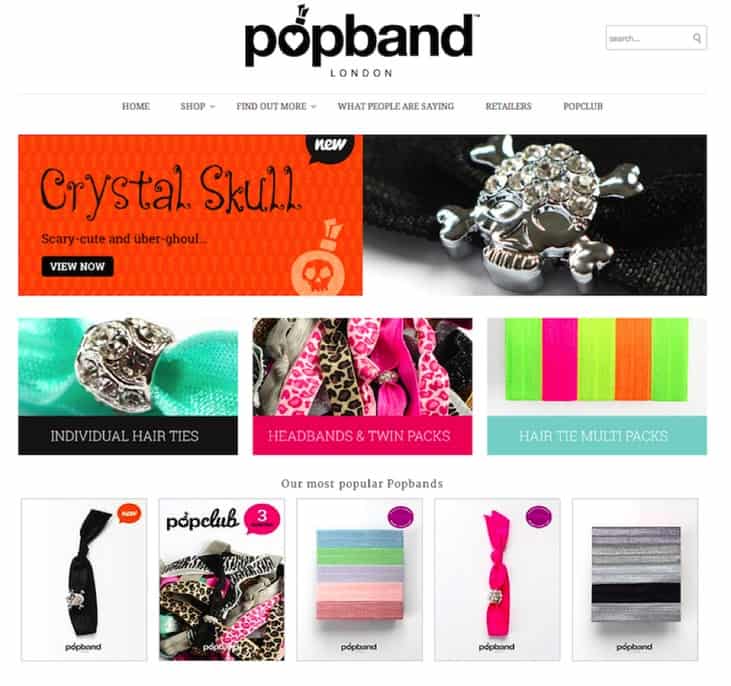
Popband highlight their most popular pieces directly on their homepage.
The benefits of these are four-fold;
● By highlighting your best selling items, you are pushing to the front those items that are most likely to convert, instead of leaving them buried at the bottom of category pages that the shopper may otherwise never make it to.
● The use of a dynamic recommendation that updates in real time, allows you to better reflect and capitalize on current trends. Sudden downpours in the middle of summer? Then your recommendation will show that more people are buying your umbrellas. Did a celebrity wear one of your dresses yesterday? Then the recommendation will give your new hot seller pride of place.
● Bestseller recommendations also work psychologically by leveraging the power of the crowd. While we are encouraged to be unique, humans naturally looked to peers for approval and endorsement. The support of a crowd reassures us that we are making the right decision, as it is not based on our wisdom alone. This is particularly helpful with technical or sophisticated items such as computers and smartphones, as we tend to believe that others are more knowledgeable on complicated subjects than we are.
● Knowing that a piece is popular can also encourage conversion by implying scarcity. If we see that something is suddenly trending then there is an inherent fear that this means it may soon run out, getting shoppers to act more quickly.
Personalized recommendations for existing customers:
Let’s return to our bricks and store analogy. Someone that has shopped with you a number of times walks into your store. You ignore the fact that the last time they came they told you they just had a baby and recommend them an expensive, frivolous, bells-and-whistles speaker set (sure to wake up sleeping children) because it happens to be the item you are promoting at the time. This is despite the fact that you have a range of top-notch video baby monitors. Whether
The result? Firstly, the customer is aware that you do not value their business highly enough to remember anything about them and so any chance to strengthen the relationship, offering a service rather than a product, is lost. Secondly, they now have to commit their own time to sifting through the store for the item that may be of interest to them. It is exactly the same in the virtual world.
There are two possible solutions to this:
● Take advantage of the data left on previous visits by creating a ‘recommended for you’ section. This is a selection of products based on a customer’s unique browsing and buying behavior, providing them with a tailored way into your store. We are, of course, more likely to be attracted to things that are in line with our tastes and needs and so you are much more likely to entice them further into the site.
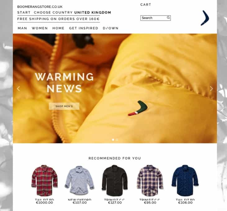
Boomerang have a personalized “Recommended for you” area on their homepage
● Rather than make recommendations based on what they looked at last time, list the items themselves (as long as they weren’t purchased). Shoppers often visit a site multiple times before they buy a product and the last thing you want is to make it difficult for them to find the pieces they were interested in. By immediately reminding them of their previous browsing history, you remove unnecessary friction and reduce the number of clicks needed to buy.
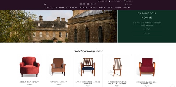
Soho Home remind customers of the items they had previously viewed
Category page
The category page – time to show off your range in full! But while this area of your site is full of opportunity it can also be a UX nightmare. Quite simply, quantity is your problem here. You may have the perfect item for your shopper, but what if it is on page 12? As we know, attention spans are short, and most shoppers give up after just a few pages.
Filtering and sorting options can be used to combat this, but they are only of use if a customer knows what they are looking for. What if they they are still in the discovery mode of shopping? Personalization could be the answer, as it gives prioritization to those items that are most relevant.
Just as with the homepage, you should go for a 1:1 personalization slot if you have enough data on the individual. This will bring the most relevant products for them to the forefront, making their shopping journey quicker and easier. Otherwise, Best Seller recommendations are a great option – again you are showing which items are the most popular and automatically highlighting the products most likely to convert. Best Sellers also work well here to show range – by highlighting the variety that can be found in a category you give shoppers an idea of what they might find and encourage them to browse that little bit further.

At the bottom of their pages Sarah Raven use Best Seller product recommendations – which is particularly useful for seasonal businesses.
Product page
Ok, good news – something has caught your shoppers eye! But what if, on closer inspection, it isn’t quite what they are looking for?
The good news is that the fact that they clicked on the item is enough to give you valuable insight, even if the product isn’t exactly what they wanted. A click is a sign of interest, it shows you something about what they are attracted to, what grabs their attention and that can help you lead them to the right product for them. How? By showing them what other people who looked at the same piece, others who also felt that initial spark, eventually went on to buy.
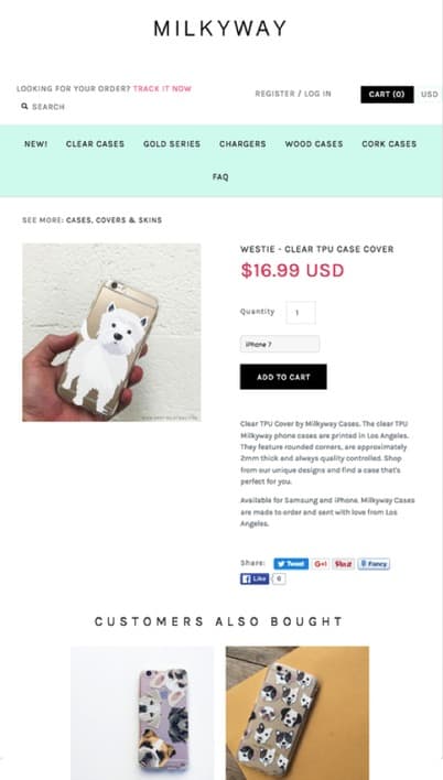
MilkyWay uses the product page to suggest alternative items based on what people looking at this piece went on to buy.
Alternatively, maximize your financial returns by increasing average order value. The product page is a good place to do this, as it well suited to upselling. You know the type of product they want, why not convince them to get the more expensive, high-spec version? Do this by showing them alternatives with a higher profit margin. Just remember to set a price threshold on the recommendation so that you are leading them up the price range rather than down!
If you want to be thorough and open up the possibility of small but relevant basket increases then suggest supplementary items as well.Cart page
The aim of your cart page is, of course, to convert your customer and it should be optimized to this end. But while you may be tempted to just try and get the sale across the line, you could be wasting a valuable opportunity. Customer acquisition is hard and expensive and so, as we have seen with the product page, any chance to increase average order value should be jumped upon.
On the cart page, this means encouraging customers to indulge in impulse purchases. At this stage, shoppers at least think they have everything they need and generally aren’t looking to compare or browse further, which is why items added at this stage will be spontaneous by nature.
Small-ticket items that complement what a customer is already buying are a quick win. For example, if you sell electrical goods then batteries or power adapters. This not only maximizes your chances of increasing your AOV but also provides good customer service by ensuring they have everything they need to enjoy their new purchase.
A recommendation to help them meet a monetary threshold for free shipping is another possibility. Free shipping can be a big draw for many customers. But with it coming at a cost to your business it may well be the case that you don’t want to offer it until a certain in-cart value is reached.
But don’t just tell customers what they need to hit a target- help them get there! Calculating how much they have left to go is one thing, but what about showing them the items that will bridge that gap? To do this create a recommendation based on the contents of their cart but with product ranges limited to those which push a customer above the free shipping threshold.
Finally, consider using the space on the cart page to remind shoppers of items they had previously viewed but not added to cart. Sometimes shoppers forget about items they were genuinely interested in during the shopping journey – this makes it easy for them to re-engage with pieces they had forgotten about.
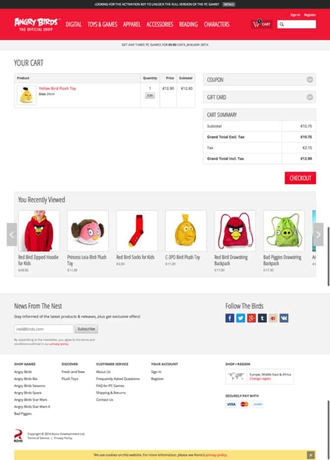
AngryBirds use the cart page as a last chance to remind people of the items they looked at in case they forgot anything.
404 page
Your 404 page is often seen a dead-end – an undesirable part of your website which only hurts the customer journey. But that doesn’t have to be the case. Some companies turn their 404 page into a humorous brand-promoting page, and that is a great use for it. But consider what you really want at this stage – getting your shopper pack on track should be a priority. And recommendations are a great way to do it.
Consider all of the following approaches:
● Cross-selling: This looks specifically at what the user was trying to view and then recommends similar items, allowing you to immediately leverage their initial intent. For example, if someone comes to your store looking for a drill but that particular model is sold out, you would show the most similar products so they can continue their buying journey.
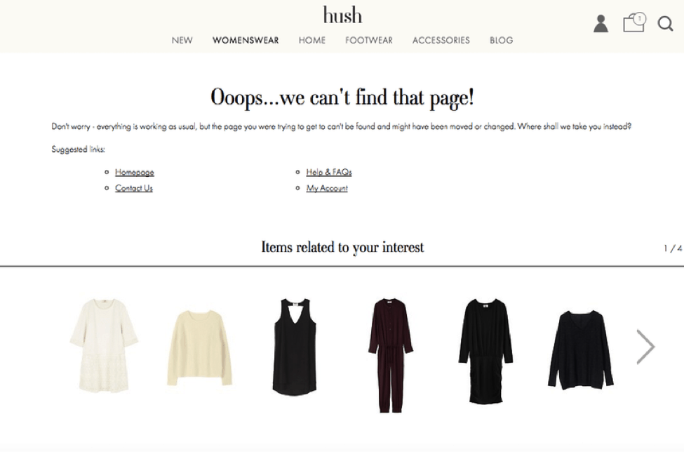
Hush capitalize on the 404 page by recommending items that were related to what they were looking for.
● Landing page recommendations: These work when people are coming to your site from an external source. They do so by capturing the data from all visitors to the broken page and making recommendations based on what they went on to view and or buy. Again, the aim is to let them continue in the most relevant way.
● Browsing history recommendations: These work for customers who have some browsing history on the site. By looking at their past interactions you are able to show them other items that likely to be of interest.
● Most popular items: If none of the above are possible, then consider showing your most popular products or categories is a good alternative. As we have already seen, these have proven themselves to be the most likely to convert and, if edited dynamically, will also capitalize on current seasons and trends.
So, there we have it – personalization for every page of your website. Helping you to achieve your business goals and giving your customers a better shopping experience.
Nosto enables online retailers to deliver their customers personalized shopping experiences at every touch point, across every device. A powerful personalization platform designed for ease of use, Nosto empowers retailers to build, launch and optimize 1:1 multi-channel marketing campaigns without the need for dedicated IT resources.
