
When building a successful eCommerce website, it is important to keep in mind that its primary purpose is to lead your visitors down a sales funnel and convert into buyers. Website navigation is the centerpiece of your website and should not be taken lightly.
Poor navigation around the site creates roadblocks in the product discovery, frustrates the user and leads to high bounce rate. While optimized site navigation removes any friction and supports users through every step of their customer journey, which results in higher conversions.
Whether you are starting your eCommerce website from scratch or decided to tweak your existing website navigation for better results, you can benefit from the 6 tips we are giving you today on improving your website navigation. They’ll provide a smooth shopping experience to your customers and thus increase your site conversion rate.
Tip #1 Place standard elements in standard places
Start with this rule of thumb: Don’t let design get in the way of usability.
One of the most common mistakes of webmasters is getting away with creativity and putting standard navigation elements in unusual places. Unique forms of navigation might look attractive for some projects, but when it comes to eCommerce, it is often best to follow common design and navigation conventions. The eCommerce website design should include the right combination of user experience conventions and branding. Most importantly, it should provide familiar and intuitive navigation that shoppers recognize.
So, put navigation in standard places where people expect to find it – that makes your site easier to use. As a result, the bounce rate will reduce and more pages will be viewed which help a great way to increase the conversion rate.
It is easy to stick with conventions if you know what customers expect.
Here are some common navigation patterns:
- The main navigation bar is near the top of the page (for a wide range of products like marketplaces),
- The main navigation is on the side if it is a small store with a few products,
- The cart is at the top right,
- The company logo is in top left, clickable and leads to the homepage,
- The company contacts are in the footer,
- Hidden menu – which is sometimes called a hamburger menu, is also more widely recognized on smaller screen devices like laptops, and mobile devices.
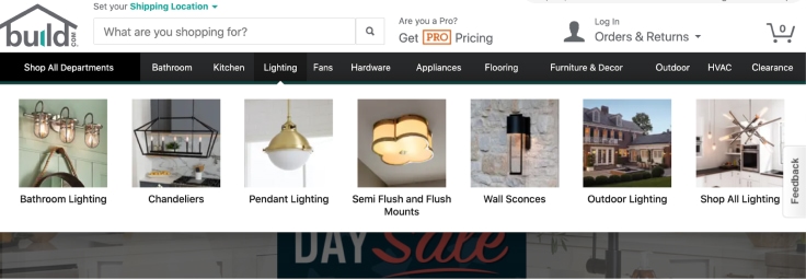
However, if you want the design to express the store’s personality, you can include, for example, multimedia in the header navigation bar but make it obvious that visitors can click. Check out this example of Buld.com:
Tip #2 List categories and subcategories
Limit your navigation to as few items as possible. Websites with hundreds of links on the home page look cluttered and distract shoppers’ focus.
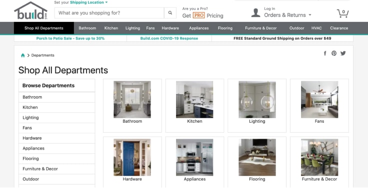
Look at our favorite example of Build.com. Most of the top-level menu labels are simple and consist of a single word. It is a minimalistic design that offers less scope for any distractions.
To build such clean navigation, start from arranging products in a hierarchy of categories and subcategories moving from the general to the specific. But some products might naturally appear in over one hierarchy. In fact, in order to improve product visibility, many brands include the same product item under different categories. In this case, the chances of sales of the product item are always higher.
Tip #3 Optimize Search
Your on-site search is the key navigation functionality your visitors use to find what they came for.
But if your website search doesn’t perform as expected, it creates friction on the path to finding the desired product. That translates to a wasted opportunity for engaging and converting a potential customer.
Below are a few ways to make sure your website search engine provides the best possible user experience and paves the way for conversion.
Autocomplete
Today’s consumers have certain expectations for site search. Predictive search, or autocomplete, is one of them: search predicts the user’s query and provides suggestions as the user types. Such functionality saves them the effort of typing, and quickly navigates to products they are looking for.
Spellcheck
Un-optimized search engines have trouble parsing typos. Your visitor might make an error in their search query and get no results. They will simply leave your site unaware of the extent of your offerings.
By enabling spell-check and autocorrect you can maximize the chance of getting your potential customers to the results they want.
Synonyms
Fixing that “no results page” is the most critical in optimizing your navigation through search.
And it can easily be done by setting up synonyms.
Imagine you have a furniture store and you list multiple products for “sofa” but your users search “coach” and end up with empty results. If you set up “sofa” & “coach” as synonyms, users who look for a sofa or a coach will see the same results.
Tip #4 Enable Filtered Navigation
Not all eCommerce platforms have the functionality for filtering the products you list, though I don’t think you need to be convinced that such functionality is essential for retail. It is the central part of product browsing and navigation experience. When done right, it takes seconds for a user to narrow down the catalog of thousands products to a few that match their preferences.
- Make sure you add filters not only to category pages but also to search results page,
- Choose the optimal place. The traditional left side bar with filters is not always the best choice. For certain types of eCommerce sites a horizontal filtering bar performs better, especially for those with fewer filters,
- For those sites that have too many filtering options, it’s worth considering to create filter groups and make those groups toggleable.
Tip #5 Product labels
Talking about additional assistance in guiding your visitor to the offer they might be interested in, consider adding product labels with stimulating call-to-action texts to store items: “New”, “Limited edition”, “Holiday Special Offer”, etc.
Labels have long proved their effectiveness in boosting sales.
- Use restraint. One of the common mistakes store owners make is adding them to almost all their products, forgetting that it is all about calling attention to why this particular product is special among others,
- Use familiar simple words to make users able to process quickly when scanning product lists.
Below is how Converse.com uses product labelling to help customers find the best fit for their needs:

Tip #6 Product recommendation blocks
Product recommendations, if implemented well, can literally multiply your conversion rate.
The position of recommendation blocks influence how effective they are. We discovered that widgets placed above the fold are twice as effective as widgets below the fold.
Place “best sellers” block toward the top on your homepage. It will be especially helpful for your first-time visitors who have no prior knowledge of your brand’s products to start browsing and discover products they need. As they engage with your site, the recommendation engine will begin to understand what types of products this customer is interested in, and provide more personalized suggestions.
The ‘Customers Who Bought This Product Also Bought’ and ‘Similar Products’ widgets are well-known top performers. Make sure you have them on your product page.
Recommendation blocks based on personalization make it easier for customers to navigate through the site and help them find what they are looking for and so far is the best-known tactic for upselling and cross-selling.
That was the most fundamental navigation that should be in place on almost any eCommerce website and now let’s recap:
Key takeaways
- Be expected. Put navigation to an easily locatable place, where people expect to find it.
- Optimize your search. When someone uses the search bar on your site, it’s the start of a dialogue with your brand.
- Personalize navigation by adding product recommendation blocks.
As you can see, optimizing your website navigation is all about putting your customer front and center. That makes it all worthwhile to put some effort into improving your website navigation and making it more customer-friendly.
Each eCommerce platform has its limitations and the default settings will take you so far towards providing well-optimized navigation that converts your leads. That’s where advanced solutions come into play.
The most ultimate choice would be an all-in-one eCommerce search solution that has tools for optimizing your onsite search, adding filters, and building personalized recommendation blocks. And the best part is such a versatile search and navigation solution available on the market at a reasonable price!


Comments (2)
Dennis Walters
12.08.2020Navigation is the key factor make more conversion I agree with that, this article has depth information on how to make more conversation on website and convert them on the lead. Amazing article and hope to keep more post like this.
Prisync Team
24.08.2020Hi Dennis, thanks a lot for your comment, we’re glad to be helpful!
Comments are closed.