
It’s funny how, despite how complex the human mind appears, psychologists are continually finding predictable and reliable patterns in behavior. The types of people we’re attracted to, the ways we choose to relax, the factors that determine our buying decisions. While far from absolutes, when spread out upon a large enough number of people, these theories hold true.
It’s a good thing for us eCommerce professionals that we deal with large numbers of people, and can use these statistics to our advantage.
The psychology of the human mind has a direct impact on buying decisions, so understanding it gives you a sharp advantage in eCommerce design. The more you understand your shoppers, the better you can craft your site to encourage more and bigger sales.
But to spare you 8+ years of higher education getting a psychology degree, we’ll take a shortcut by explaining the 9 most useful psychological findings pertaining to eCommerce, and how to apply them.
1. Loss Aversion Works Better than New Gains
Daniel Kahneman and Amos Tversky’s pseudo-famous prospect theory can be summed up in a single line: “losses loom larger than gains.” What this means is that a person will likely choose in favor of avoiding pain than acquiring pleasure.
The most direct application to eCommerce design is in how you phrase you copy, especially call-to-action cues. You want to point out what they’d be missing out on instead of bragging about what you’re giving them.
For example, instead of mentioning how much they’ll save by shopping with you, mention how much they’ll lose by not shopping with you. Phrases like “Save $20” are not as effective as “Don’t lose $20 worth of saving.” Even phrases like “Don’t miss out on…” tend to make promotions seem more enticing.
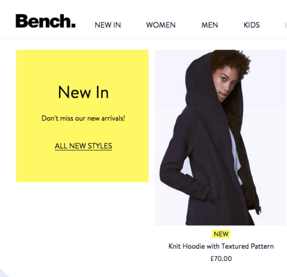
Even something banal like the home page card for New Arrivals can be spiced up with a little copy aimed around loss aversion. Bench’s addition of “Don’t miss our new arrivals!” isn’t necessary, per se, but it does add a bit of urgency that makes checking it out more appealing.
2. Realistic Models in Pictures
People naturally relate to other people, whether in person or photographs. This is surely not news to advertisers, who, since the dawn of advertising itself, have been using images of perfect scenarios in hopes of showing shoppers how their lives could improve if they buy their product.
What might be news, though, is that this technique is slightly misguided. Perfect scenarios aren’t as effective as realistic scenarios.
A British study showed that skinny models were not more effective than realistic models, and, more importantly, the realistic models left the viewers feeling more positive–a great effect for eliciting eCommerce shoppers to buy. The study tested both men and women, so the ramifications are far-reaching for eCommerce design.
Essentially, you want your models to look like your shoppers. Using realistic models makes it easier for customers to put themselves into the scene, whereas supermodel-types might break the illusion of realism, or make the customer feel bad about themselves, which will drag down your sales.
Especially in the fashion industry, you want your shoppers to think “they look like me, so I’ll look as good as they do in that.” If they think “I’m not nearly as attractive as they are, so those clothes won’t look that good on me,” then you’ll likely lose the potential sale. Of course you still want your models to look good–that makes the clothes look more appealing–but they should be attractive in a realistic way.
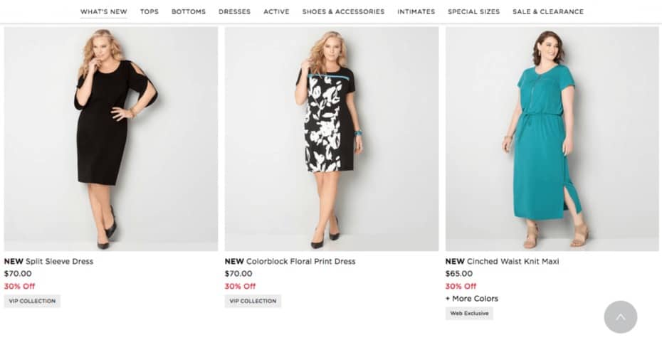
Avenue uses realistic models to target to realistic women. Not only does this reflect better on their shoppers, it also sets them apart from other fashion retailers.
3. Ben Franklin Effect
This next tip is a bit more involved in theory, but it’s application in eCommerce design is fairly straightforward.
It’s a psychological phenomenon that can be summarized as the Ben Franklin Effect, after a meaningful passage in the famous polymath’s autobiography:
“He that has once done you a kindness will be more ready to do you another, than he whom you yourself have obliged.”
Franklin’s observation was proven correct nearly a couple centuries later. In 1957, Leon Festinger published his theory on cognitive dissonance, a cornerstone of social psychology. The theory puts forth that human minds desire internal consistency, and tend to rationalize inconsistencies in order to make them “fit in” to the greater picture.
So, if someone does you a favor, internally their mind rationalizes that they must like you, thereby increasing the chances that they do you another favor. In business, this translates into something like, the more a person invests energy into a brand, the more likely they are to do business with the brand.
Naturally, you want to start out with small favors, and then build up from there. We use the term “favor” loosely–really, it’s just any extra effort your shoppers put into your site beyond browsing and buying. Some good places to start are:
- Signing up for email newsletters/notifications
- Joining a social media group
- Answering a questionnaire
- Interacting with a widget on your site
- Commenting on/sharing content
- Periodically checking back on your site
As you can guess, social media plays a large role in implementing the Ben Franklin Effect. Social media sites are often the perfect gateway into deeper customer involvement, and a great medium between zero effort and too much effort. Don’t take the term “favor” too literally–it’s still advantageous to give them incentive to interact, which we’ll explain in the next section on reciprocity.

Almost every eCommerce site today has an opening modal window asking for an email address, a common example of a Ben Franklin effect favor. It can get annoying after awhile, but Lazy Oaf handles it perfectly.
First, you can ignore the window without clicking on it, and it’s small enough to scroll away from or see around it. Next, it explains the value of signing up (receiving news) without being overly wordy. And last, it’s a clever design, reminiscent of the older computer windows that pile up.
4. Reciprocity
Reciprocity is the psychological explanation behind a traditional, tried-and-true sales technique. It essentially boils down to “you scratch my back, and I’ll scratch yours.”
The Norm of Reciprocity or just “Reciprocity,” is another social psychology fundamental that almost feels like common sense even if you’ve never heard of it before.
Basically, humans feel obligated to repay a favor when one is done for them. Some psychologists theorize it’s an urge honed by evolution, as it encourages cooperation, which is beneficial to survival.
Regardless of why it exists, you can apply these standard sales techniques to mine the rewards of reciprocity:
- free gifts
- free shipping
- free content (blogs, shopping guides, entertaining videos, etc.)
- discounts
- sales
- coupons
- special promotions
Just think about receiving free samples at the grocery store… that feeling of guilt or shame when you walk away without buying anything is a symptom of the norm of reciprocity.
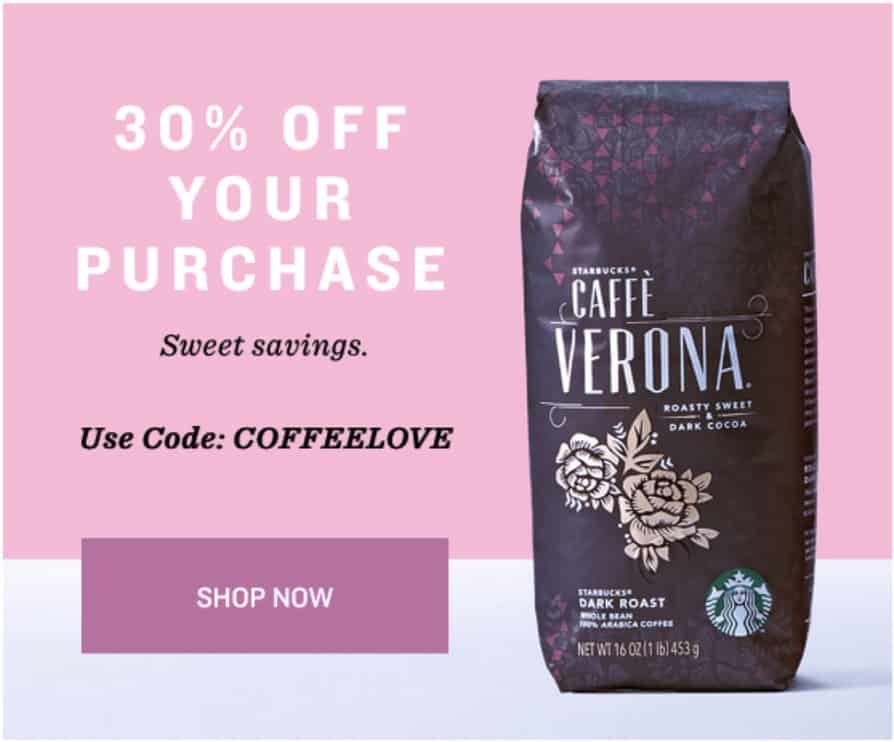
Placing the coupon code directly on the home page may seem like an empty ritual–after all, they could just lower the price and leave it at that–but it’s done for the sake of reciprocity. Aside from the joy of typing in the code at the checkout, providing them with the code up front, like Starbucks, makes the discount seem more like a gift, which in turn makes the shopper feel more grateful.
5. Scarcity and Time Limits
You don’t need a psychology degree to understand scarcity. One look around at the lives of others–or even your own–will show you that people want what they can’t have.
This observation was cemented in scientific fact when a study showed people were shown two jars, one with a few cookies and one with many. The cookies in the jar with only a few were considered more desirable for no other reason than their scarcity.
The reasoning is that scarcity suggests that an item is high value, which is why it’s “running out.” Likewise, items in abundance must be low value, as if they’re abundant because no one wants them. Scarcity also suggests social proof, described below, and incites elements of loss aversion; the thought of them missing out on an item or deal becomes all too real.
When it comes to eCommerce, the psychology of scarcity fits the theory of supply and demand like a glove. Because the reasoning turns out to be true–higher value items sell out faster–eCommerce designer have only to show the lower stock to demonstrate scarcity. But this psychology principle has more than one application, and here are some techniques to use on any item:
- Ticking Clock–Giving your promotions a time limit has been proven to increase sales. Try adding a timer to your product pages so your customers know they only have a few days, hours, or even minutes, to take advantage of a deal and, more importantly, avoid a loss.
- Low Stock Notices–Including a notice like “only 2 left in stock” is the scarcity principle at its finest. It’s the eCommerce manifestation of the “cookie jar” experiment.
- Limited Editions–Selling limited editions products takes the principle a step further. Whereas low stock notices insinuate the stock could always be refilled, limited editions means once its gone, it’s gone forever. The exaggerated scarcity often comes with an inflated price tag as well.
With scarcity, use moderation. Too much pressure will have the adverse effect–the shopper won’t even bother. With scarcity, a little goes a long way.
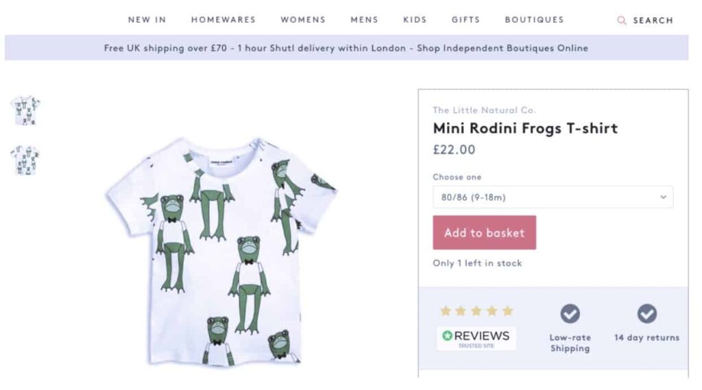
Trouva understands the significance of scarcity. I don’t even have a kid, but seeing that there’s only one of these in stock kind of makes me want to buy this children’s shirt anyway.
6. Social Proof
To understand the psychology of social proof, you must first understand that humans are social creatures and have a natural herd instinct. That’s not to say we’re all followers or “sheep.” True, each person is an individual–but no one is such an individual that they’ll stay in a burning building just to be different!
In fact, the numbers don’t lie about the power of social proof. Almost 70% of online shoppers rely on reviews before making a purchase, and consumer reviews are nearly 12 times more trusted than product descriptions. Moreover, the mere inclusion of reviews in eCommerce increases sales by %18.
The trick is to display the product’s ratings prominently, in the landing screen near the title if you can. You also want the customer reviews available nearby (though not necessarily on the landing screen, since they take up a lot of room). Nearby means the shoppers doesn’t have to scroll far before finding what other people think about the product.
Another strategy for social proof is social media–the numbers for followers and likes are clear indication of how many people value your project.
Last, social media influencers speak louder than average reviews. Try to earn a positive review from your industry’s top social media personality, since they’re generally considered more trustworthy in their niches.

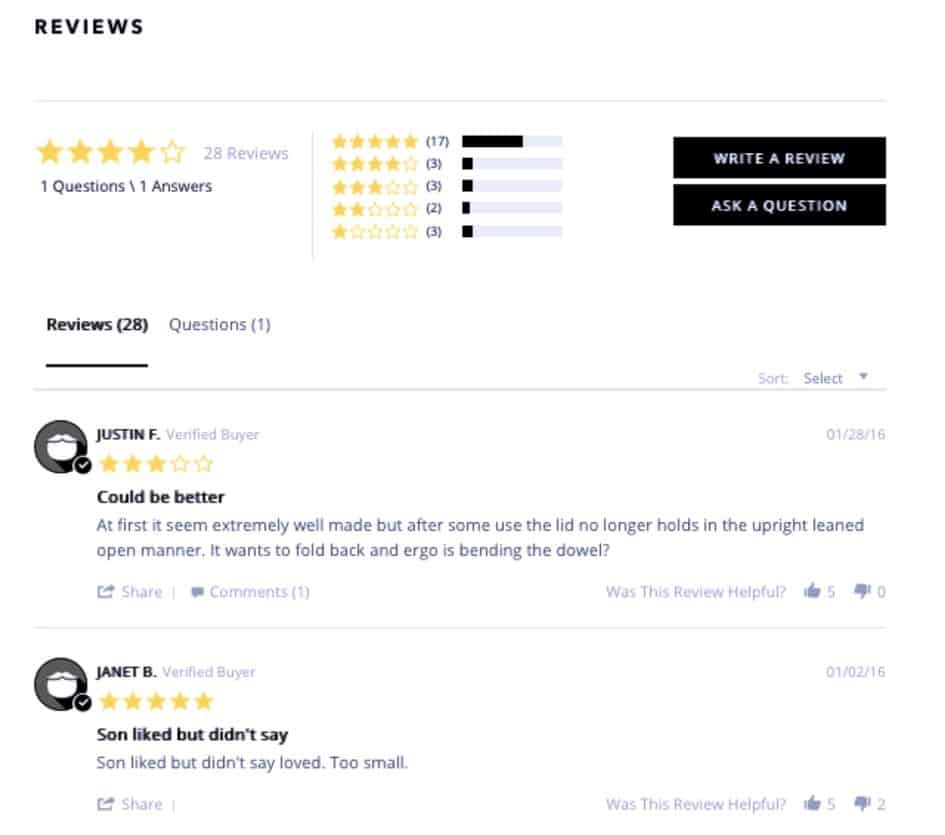
The best format for reviews on the product page is to put a summary near the title and the full reviews when you scroll down, as Beardbrand does. The star rating is immediately visible–and colored to draw attention–while the lengthier text reviews are just a quick scroll below.
7. Choice Paralysis
In the 1950s, British and American psychologists William Edmund Hick and Ray Hyman proved what’s today commonly referred to as Hick’s Law, or “choice paralysis”: the more choices a person has, the longer it will take them to decide. This has enormous ramifications on eCommerce, considering that more time inevitably leads to abandonment.
So, the trick is to combat choice paralysis while still giving shoppers the variety of options they crave. This is a challenge to every eCommerce brand, even the all-powerful Netflix, who once offered one million dollars to whoever came up with the best recommendation system.
Still, there are some reliable methods to reduce choice paralysis in eCommerce design:
- Product Recommendations–Try to personalize recommendations as much as possible to each specific shopper. Like Netflix or Amazon, think outside of the box–instead of just the most popular products, try to decipher the individual’s tastes based on their past purchases, ratings, or views.
- Highlight Key Features in Product Descriptions–Use an eye-catching typography for the most important elements in product descriptions, to make them seen first.
- Intuitive Navigation System–Reorganizing your products under more specific or relevant product categories can help show customers only the products they want to see. Try conducting a Card Sorting test to determine how your target shoppers specifically categorize your products.
- Simplify the Rest of Your Interface–Reduce cognitive overload in general by using simpler, less-cluttered interfaces. The closer you get to minimalism, the less distractions your shoppers have, allowing them to concentrate on decision-making.
- Provide Shopping Guides–An alternative strategy to reducing options is to clarify options. A shopping guide or comparison chart can simplify information and present it more clearly, allowing shoppers to make better and faster decisions.
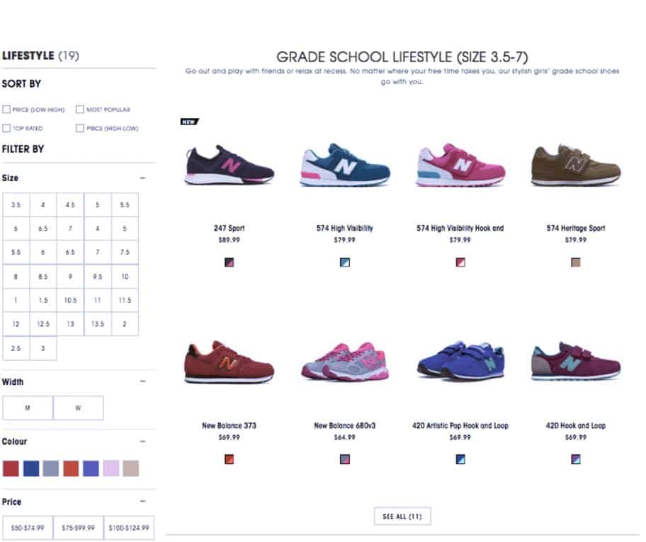
New Balance’s navigation system goes above and beyond with plenty of filters to suit the needs of many different shoppers. Size, width, color, and price could all be top-priority factors for different types of shoppers–especially size, because displaying options that aren’t available in the customer’s size is just an unnecessary waste of time. Each filter allows browsers to preemptively remove choices that aren’t relevant to them, leaving only serious possibilities and shortening the list of candidates.
8. Identity Labeling
“I’m a manly man and I need a razor to reflect that.”
“I need a watch that shows the world I’m classy.”
“I want a top that says ‘I’m sexy,’ without being too revealing.”
In the 21st century, the products we use are reflections of our identity–that’s one of the advantages of having some many choices. When designing an eCommerce site, you can use this to your advantage by how you label your products.
Using product images and page copy, you can alter how a product will be received. Small creative choices such as the background of the product photo or the word choices in the description can have a lasting impact on the mind of the shopper, even after their purchase.
To apply this, you must first know the type of people that visit your site and how these particular people identify themselves. Do they think of themselves as casual or professional? Conservative or adventurous? Remember, it’s not so much about how they really are as how they think of themselves or want to be.
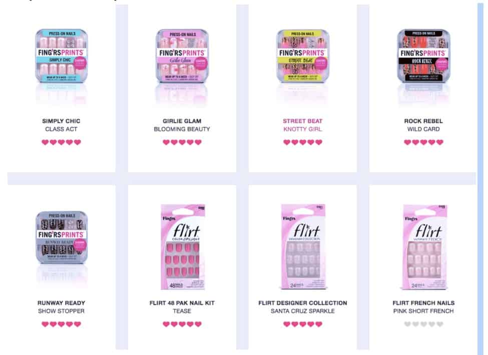
Fing’rs organizes their artificial nails into descriptive product names of the products themselves that target the type of look or “identity” they offer, such as “Girlie Glam,” “Rock Rebel,” or “Runaway Ready.” Each type has its own subcategories, such as Girlie Glam: Pretty Petals (flower patterns) or Girlie Glam: On the Dot (polka dots).
9. Give Shoppers a “Way Out” with Guarantees and Return Policies
Fear of commitment is not just fodder for romance dramas–it’s very real. Sometimes, the one thing that can push someone towards that sale is them knowing there’s a way out.
You can remove the pressure from a sale by predominantly showcasing your return policies and satisfaction guarantees. Returns are more important than you might think, especially for eCommerce. Just look at these statistics for online shoppers from invesp:
- 67% check the returns page before purchasing.
- 58% want a “no questions asked” return policy.
- 72% want free return shipping.
- 62% are more likely to shop online if they can return items in-store.
- 92% will buy a product if returns are easy.
Since return policies can make or break a sale, it’s important to showcase them on your site. This reduces the risks involved in shopping online, and often wins over otherwise hesitant would-be customers.
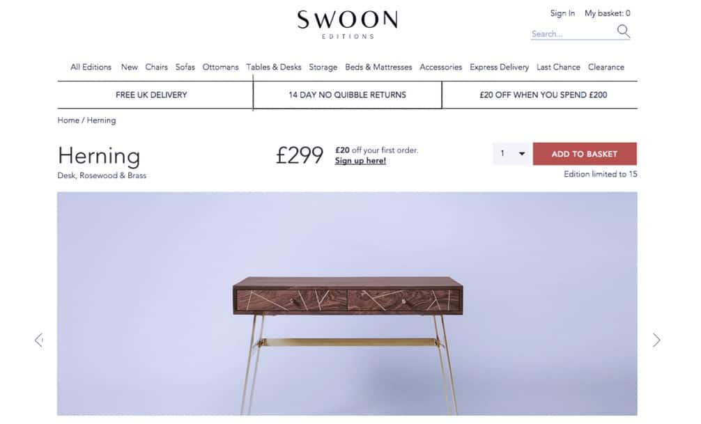
In a principal spot at the top of the product page, the British site Swoon Editions advertises their cleverly named “no quibble” return policy.
Takeaway
As an industry designed around people, every salesperson has a little bit of wisdom on human psychology… even in eCommerce. Do you have any psychological sales advice, or perhaps even a fun story? Share your thoughts in the comments section now.


Comment (1)
Karolina Kulach
28.09.2017An interesting aspect related to the psychology and power of marketing in ecommerce is COLOUR. Our brains process visual content 60,000 times quicker than words and colour increases brand recognition by 80%. So colour may be your first act of ecommerce persuasion: for over 90% of people, colour is crucial when it comes to making purchasing decisions. To find out how it works, check out this article webinterpret.com/us/blog/sell-the-right-colour-the-power-of-colour-in-international-e-commerce/
Comments are closed.