The pricing page is one of the most important landing pages on your website. It has a huge impact on a customer’s decision to make a purchase.
Like anything that comes with a price, customers are very picky about details. They have a lot of pet peeves about product features, prices, and plans because they want to get their money’s worth. And if you’re an online business, you can’t convince them personally.
How important is a pricing page?
Lytti.com, a Finish event management company, ran a test to find out. Their original pricing page had short descriptions and didn’t explain their product features in-depth.
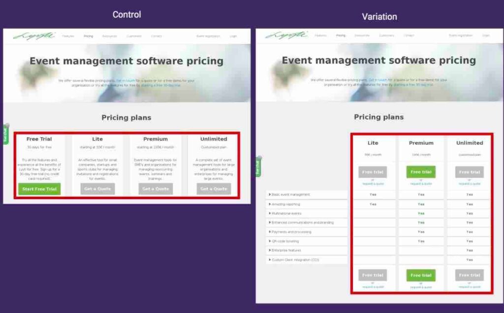
They then created a landing page that included the product’s features, CTA buttons, and free trials. The result? An increase in lead generation by a whopping 93.71%!
That’s a lot of sales for a slight modification.
The bottom line is that you need an effective pricing page to get customers to act.
But how do you create an effective pricing page? What are the elements you need to convince customers? Let’s explore the different elements of pricing pages and check out some high-quality examples:
Main Headline
When visitors arrive on your pricing page, their eyes will immediately be drawn to the main headline and subheadline.
Ideally, this should state the benefits and the unique value proposition of your product. The sub-headline substantiates it with more details. If these sections are unclear or confusing, customers won’t understand what you’re trying to sell.
Here’s an example from Trello:

A good headline is short, concise, and compelling. It should provide a clear benefit like earning money, learning a skill and more.
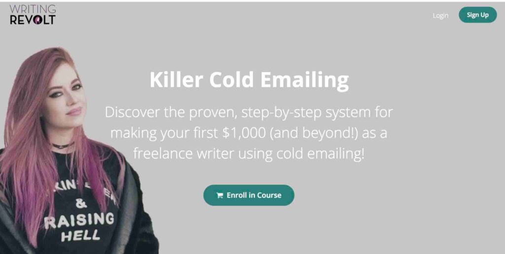
For example, Jorden Roper’s headline for her cold emailing course immediately says what the course is about. The sub-headline goes into greater detail, with accurate and measurable benefits such as making $1000.
Eye-Catching Image
A layout isn’t complete without visuals that can draw people in. You need a good layout so customers automatically read your main headline or sub-headline.
Let’s take a look at this landing page from Spotify. The copy emphasizes that you can be happy by going premium. It’s accompanied by a happy woman that’s dancing to the music.
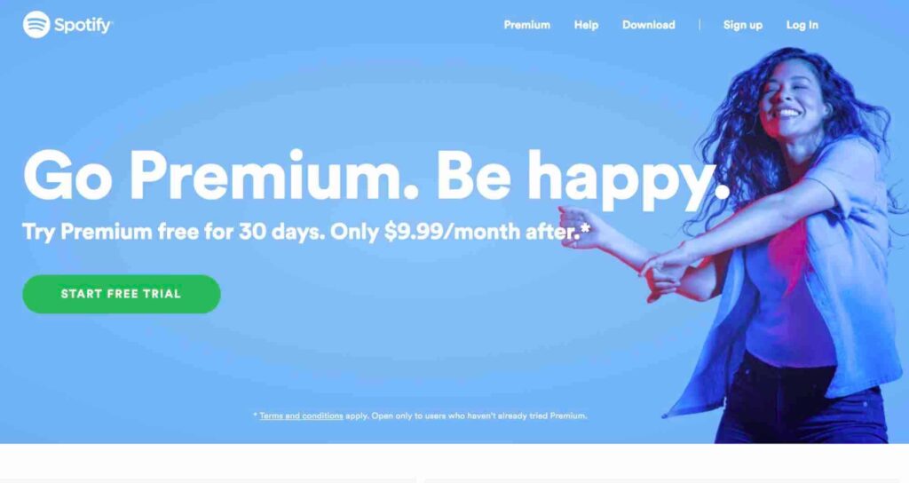
A well-designed landing page can do wonders for your conversions. In fact, landing pages with people smiling get higher conversion rates.
There are many more theories on the design that you could look into. In the end, you need to find the right balance between the images and text to make a successful pricing page.
TunnelBear provides apps that let users browse the internet securely and privately. Their pricing page also has great design. It shows a cub, a small bear and a big bear shooting laser beams out of its eyes to visualize the capabilities of their different pricing plans.

Not only does this showcase their branding, but it also highlights their personality.
Use Great Copy
Great copy is essential to your pricing page.
The words you write will either convince or repel customers to buy your product. But how do you write great copy? Here’s what you need to know:
Include Product Features
If you have a good product description and headline, then good for you!
Take a look at how Hubspot displays the features of their marketing software:
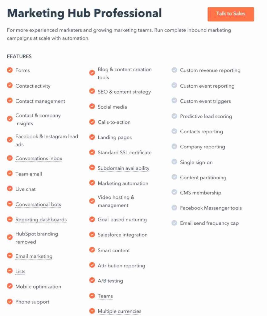
When comparing products and other services customers consider the features. As a result, it’s important to list down the features of your product. Ideally, the items on the list should be short and simple.
Use the Power of Testimonials
The key to attracting more customers is to highlight the value of your product or service.
I’m sure you’ve probably heard of the “Oprah Effect”—the fact that an endorsement by Oprah or another famous influencer of celebrity, can boost your sales overnight.
This is why customer testimonials are effective.
It shows the special results of buying your product or service. Take a look at the following screenshot on the pricing page of Jorden roper’s cold emailing course:
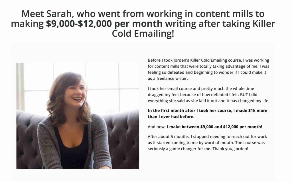
The above screenshot shows the amazing results of taking her course. One student even earned between $9,000 to $12,000 each month. Before she worked for content mills that took advantage of her skills, but now her business is thriving.
This instantly communicates credibility and encourages purchases.
Money Back Guarantee
If you love to buy e-commerce products or online courses, you’ve probably heard of money-back guarantees, otherwise known as satisfaction guarantees. Meaning when a customer is not satisfied with a product, they can easily ask for a refund.
Sixthreexero—a bike company—has gained fame thanks to this strategy. They offer a 365-day test ride! If you don’t love it, then you can send it back for free. No shipping charges required.

At face value, this seems counter-intuitive and unprofitable. If you want to make a lot of money, then why encourage refunds?
However, businesses have discovered that it has a lot more pros than cons. Not only can it reduce the perceived risk of buying the product, but if you’re a brand or service that’s relatively unknown, it can incite curiosity and boost brand awareness. And if your product does what it preaches, only a few customers will return it.
Compelling CTA
Every marketer will tell you that a strong call-to-action (CTA) is ideal for all landing pages. But this is especially true for pricing pages. After all, it’s the button that converts your customers and makes you more profits.
But how do you make a pricing page with a compelling CTA? A strong CTA uses a color that’s distinct from the whole page. For example, Detectify’s “Get Started” button has a bright pink color, which helps it stand out from the dark blue elements on the page.

Besides color, you also need to killer copy.
Don’t just say “Submit” opt for “Start Your Free Trial” or “Sign Up Free” instead. These words might seem simple, but letting customers know that getting started is easy and free could make the decision easier.
Here’s an example from MailChimp:
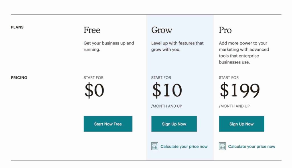
If you’re not sure about your CTA, then test what works for you.
Add White Space
Have you ever looked at a landing page that’s overwhelming and confusing because it has too many details? A pricing page without white space can make it hard for viewers to find what they’re looking for. In contrast, plenty will make your copy and headlines easier to understand and draw attention to your most important points.
For example, Casper’s pricing page looks well-designed thanks to its use of negative space.
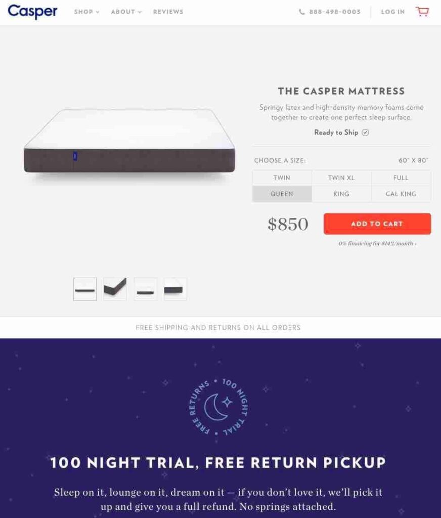
White space also doesn’t need to be white. It can be a negative or blank space that’s free from other elements.
Multiple Plans to Choose From
What are the plans you should include? How do you price your products? Here’s what you need to know:
Annual Plans vs. Monthly Plans
Some people look at your pricing page and are ready to buy. These customers usually opt for an annual plan because they want to continuously use your product.
Depending on the type of product you sell, about 5 to 10% of customers might sign up for an annual plan. And since the price of getting a year-long commitment is valuable, you might prefer this option, instead of paying monthly.
Naturally, you ought to entice them to opt for an annual plan through 20% or 30% discounts.
For example, BombBomb offers a yearly subscription with a premium setup for a one time $1,299 purchase. The annual renewals will cost $588 annually—which is a great deal if you’ll use it for many years to come.
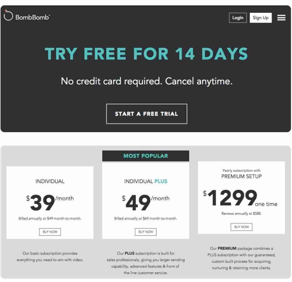
Give a Variety of Pricing Options
Whatever your product may be, you undoubtedly have different types of customers. If you’re selling marketing software in the e-commerce industry, your insights may unveil customer types such as entrepreneurs, e-commerce sites, startups, small businesses, large enterprises and more.
Different types of customers have different needs, and as a result, you’ll need to create pricing plans to reflect these needs.
For example, you may include different product features for each plan because some customers would rely on certain capabilities, as compared to others.
Slack’s pricing page is one example of this phenomenon. They offer a free pricing plan for small teams that only need basic features such as browsing recent messages and team support.
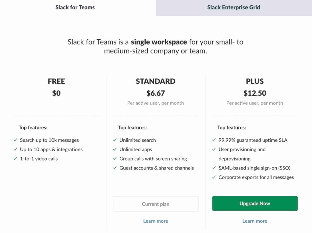
For teams and businesses ready to make Slack the hub for their projects and communications, Slack offers the standard plan. It includes Guest access, unlimited messages and other features relevant to this customer type.
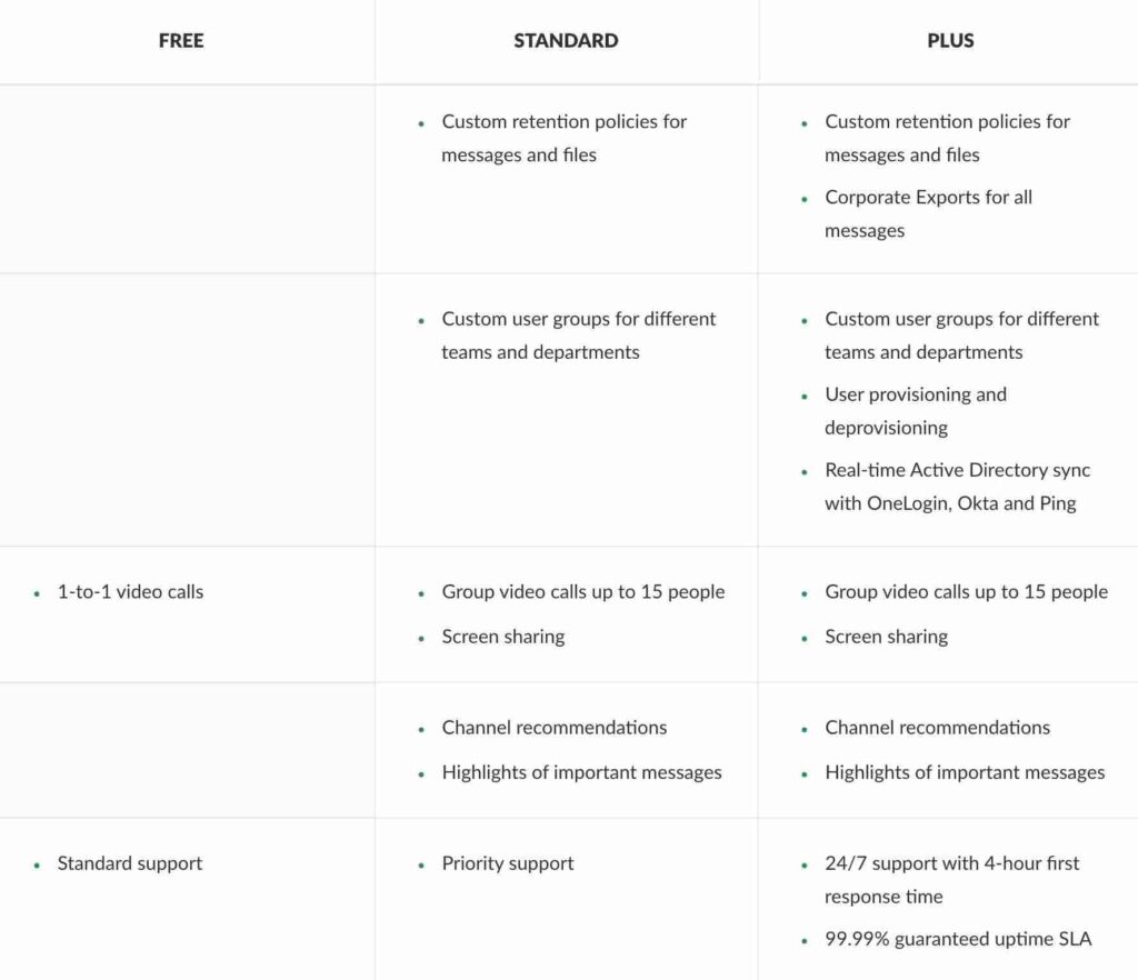
What if your business needs SSO, Compliance Exports, and guaranteed uptime? Slack has Plus features which offer a 99.99% guaranteed uptime, 24/7 support and more.
Their pricing plans are clearly based on the size of their team and the type of features that they need. Which makes sense, because you only want to pay for features that you actually use.
Leverage Urgency
You can trigger urgency by offering an additional reward or discount in exchange for a purchase. Ideally, you want to use noticeable colors (i.e. red) to capture people’s attention and draw them in.
For example, Zara has a countdown timer below their CTA which is large and hard to miss. This is one way you can make visitors eager to take action.
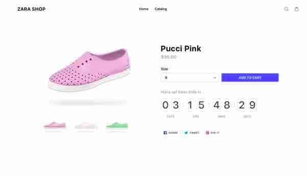
There’s no doubt that humans are compelled to act in times of urgency. If there’s a limited-time offer, we fear missing out on a great deal. So, we’re more likely to opt in and make a purchase.
Secure Checkouts and Trust Seals
It turns out that the absence of some elements can dissuade visitors from making a purchase. This is particularly true for secure checkouts and trust seals that assure customers that their data will be secure, once they make a purchase.

Keeping your customer’s financial information safe is vital in any transaction. So, you’ll want to provide evidence that your e-commerce store can do it.
How Will You Create an Effective Pricing Page?
Creating pricing pages that convert is complicated, but hopefully, this article helped you figure out the elements that you need to boost conversions.
Let’s recap
The main headline and sub-headline should describe your offer and unique value proposition in such a way that would grab your audience’s attention. You should also incorporate visuals that resonate with your branding.
What about your copy? Highlighting your product features in a simple and concise way is key. You can also use testimonials to boost social proof and increase the perceived value of the product or service you’re offering. And, don’t forget to add money-back guarantees, to let customers know that the purchase is worth it.
Add whitespace or negative space so that the relevant information and visuals don’t seem too cluttered. You can also add a noticeable and compelling CTA and include the multiple plans available to your customers.
Remember: The pricing page is one of the most crucial components of your marketing funnel. It’s the page that customers visit when considering or making a purchase. The more effective it is, the higher chances you have of converting customers and making profits.
What does your pricing page look like? And what were your results? Let us know in the comments below.
